If the pen is mightier than the sword, then the printed word has brought revolution in this world more swiftly, more often than war. Since Johannes Gutenberg first invented the movable type printing press in 1439, printed matter has given voice to dissent over dogma and freedom over ignorance. In the six centuries since, his invention has enabled mass communication and the unfettered distribution of ideas from one language to another and across the globe.
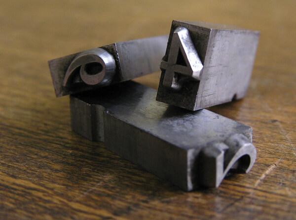
Moveable type cast in metal. Image by Daniel Ulrich. Used by CC license
Before moveable type came along, each page would have had to be cast in metal prior to being used to print on paper or velum: a lengthy process that was commercially unviable. Gutenberg’s genius lay in casting vast numbers of individual type from metal and in using these over and over again. As this reduced the cost of printing and the time required to print, books became cheaper and more easily available.
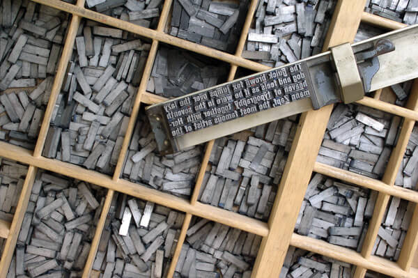
Moveable type and composing stick similar to tools used in letterpress. Image by Willi Heidelback. Used by CC license
As Europeans conquered new lands, bringing their religion and administration to exotic places, moveable type technology spread rapidly around the world— for what would bureaucracy be without paperwork and Christianity without the Bible? Soon it became inadequate to use the Latin script for Asian languages. Printers were commissioned to design type based on native scripts and so began a whole new chapter in the history of the typeface design when they began to translate writing on palm leaves, stone and carvings into typefaces that could be made of metal. It was as exciting a process as it was laborious, but nowhere was it as innovative as in the Indian sub-continent, rich in lingual diversity and expressions of the written word.
By the late 18th century, type for the Tamil alphabet had been used to print the first Indian language books; Bengali and Devanagri followed soon after. Today, nearly 90,000 new titles are published every year in India of which 25% are in English, 25% in Hindi and the rest in the country’s myriad languages. In the 21st century, we’re reading language on countless new ways: on phones and computers, signboards and billboards, newspapers and reading devices. Our encounters with typefaces have increased exponentially and they have become permanent occupants of our visual world.
If typography is considered to be the arrangement of letters and type design is the formal expression of those letters, then between them, they inform what language looks like. It is through type that literature, poetry, ideas, discourses and histories are made visual. Identity is formed through the printed word and culture articulated through it. Indeed, with the decline of our former oral traditions, our entire way of life can be coded into written language. And when the humble printed letterform can bear witness to such a range of human expression, it is interesting to consider how type continues to adapt to our ever-changing, fast-globalising way of life.
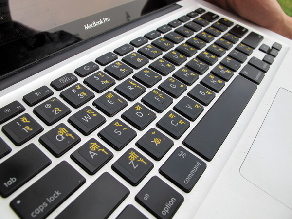
Digital devices can be adapted for typing in Indian languages. Image by Crispin Semmens. Used by CC license
Immersed in communication on-the-go, we’re online, connected, reading, watching, sharing and liking on screen-based media with a voracious appetite. We may think in Hindi or Tamil, but we access the web in English and transliterate ideas from our mother tongue into Romanised letters. The digital devices used in India have been largely developed outside of the country and to meet the convenience of global commerce; their interfaces have developed sophisticated systems for rendering English. So far, we haven’t learned how to use our native languages in digital scenarios, but as more media consumers are people who don’t use English – or prefer not to – a group of ambitious young type designers are changing the languages in which we receive media information.
Letters from India
Indian Type Foundry, set up by established Dutch designer Peter Bilak and young gun Satya Rajpurohit, was one of the first foundries to offer high-quality digital fonts in Indic scripts. Critically, it made the first Indian offering of complementary typefaces across different scripts, the advantage being that a message to be communicated in English, Hindi or Marathi would have the same consistent look and feel across languages. With the development of their Akhand series, one can create designs in English, Hindi, Bengali, Tamil, Assamese and Malayalam, without losing the integrity of the design. The availability of these options has proved a boon to ITF’s clients, many of which are major media channels such as Star Plus, Star Sports, IBN 7 and Star Bangla, and has encouraged other designers to seize the opportunity.
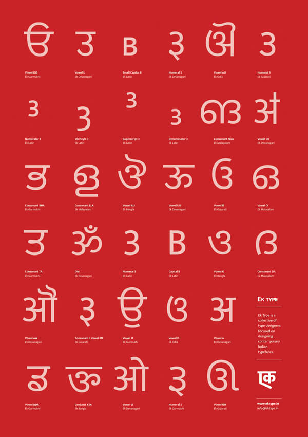
Extension of the Ek Type project into different scripts. Image courtesy Sarang Kulkarni
More recently, the Mumbai-based collective Ek Type has also released complementary font sets for Devanagri and Latin fonts. Led by Sarang Kulkarni, the team is aiming to produce versions of this typeface in every major Indian script. Kulkarni reflects, “our aim is to create typefaces without losing the script grammar. Every script in the world has its own history and cultural heritage. Compromising with script because of technical limitations or globalisation or standardisation can lead to loss of its hereditary values. Technology should be used such that it does justice to every script that we design even if the scripts are different from each other.”
Driven by the wish to encourage lingual diversity, these foundries provide high-quality fonts to graphic designers to use in a variety of applications and across different media. There are two major benefits to this: firstly, it offers the end user a quality experience in their native language that looks as good as English-based communication; and secondly, it encourages the constant use of that language on a daily basis. This enables brands to communicate with audiences in a cultural setting that they are most comfortable with.
Show of hand
Given the increasing availability of digital type, it has become easier for designers to work in different scripts, but at the same time digitally and mechanically reproduced text has replaced the traditions of hand-lettered, hand-painted typography. The beautifully crafted signage of yesteryear has given way to the hard, refined edges of desktop fonts. This is where the ambitious Hanif Kureshi comes in. Graphic designer, type aficionado and painter himself, Kureshi began to document the letterforms of street painters in Delhi, determined to find a way to bring their sensibility into modern graphic design. The effort resulted in his project Hand Painted Type, a digital solution to cultural preservation. Through this project, painters’ designs are painstakingly re-drawn and converted into digital fonts This allows the fonts to be distributed online, making them accessible to more people to use. 50% of the online sale proceeds go to painters themselves, and the rest towards running and sustaining the project. Where digital type is conventionally far removed from the colourful charm of painted letters, the fonts licensed by Hand Painted Type maintain the magic of India’s bazaars and streetscapes.
The original painted banner for the Painter Kafeel font that was digitised and distributed by Hand Painted Type
The lost script
If Kureshi’s efforts prevent a part of our visual landscape from evaporating completely, Neelakash Kshetrimayun’s attempt is to re-discover lost heritage. A graphic designer by training, he has spent nearly a decade researching Meetei Mayek: the script that was used to write the Manipuri language till the 18th century, after which was replaced by Bengali for political reasons. Around the time Kshetrimayun began his design inquiries into the script, the Manipuri government officially adopted Meetei Mayek in 2005. The final push to adopt the script came when a library of Manipuri books printed in Bengali were burned to the ground by pro-Manipuri protesters. The government had no choice but to relent and adopt the script, though at that time there existed no reliable digital fonts for the Meetei Mayek. Since then, Kshetrimayun has developed two typefaces. He hopes that his work has led to resurgence in the use of the type and encouraged others to reclaim their cultural legacy. As ground-breaking as his research has been, he says, “if nobody had burned the library, I might never have done this work.” If innovation pushes the boundaries towards the future, then his work shows that it also brings the past into confrontation with the present.
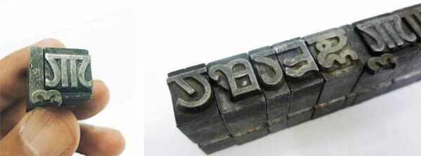
Metal type blocks in the Meetei script. Image courtesy Neelakash Kshetrimayun.
Branding with letters
Today the work of type designers influences every aspect of popular culture, responding to technology and adapting to commerce. Says Kshetrimayun, “brands that come to India have to think seriously about typefaces and it’s not just about type for a logo. Typefaces are a strong part of the visual language of everything a brand communicates. Typeface designers will need to start designing to the need of the consumer. Look at how Vodafone has developed typefaces for Indian scripts – you look at their communication and you just know it’s Vodafone.” Clearly, the value that type brings to a brand’s cultural context is immeasurable and is something for brand managers to think about seriously.
Though a niche area, international corporations are investing resources into type research and design in Indic scripts. Last year, technology leader Monotype established a Global Innovation Hub in India with the aim of bridging the gap between designers, consumers and corporations, pushing for more refined solutions in digital applications. Adobe – the company behind creative software like Photoshop and Illustrator – has been working keenly to develop both fonts and the platforms to use local language scripts. With the simultaneous progression in design and delivery, it is only a matter of time before we see more enthusiastic use of our native Indian scripts. Kulkarni has great hopes for the future and says, “writing and reading in an Indian language in an Indic script should become easy learning English in Latin script.”
Enthusiasm and the prospect of commercial gain cannot be the only drivers of innovation in this field. The use of type to express different languages is a matter of respect: respect for diversity, respect for identity and respect for the reader’s cultural intelligence. To be creative with language and genuinely committed to open communication, we have to accept the plurality of perspectives and methods needed to reach out to people. Whether one is asserting a cultural context or inventing one, by becoming engaged with notions of type design, typography and type technology we can all learn how to be innovative not just about what we say, but how we say it. In a country that loves to talk, that can only be a good thing.
***
This article was first published in the April-July 2014 issue of Innowin magazine.