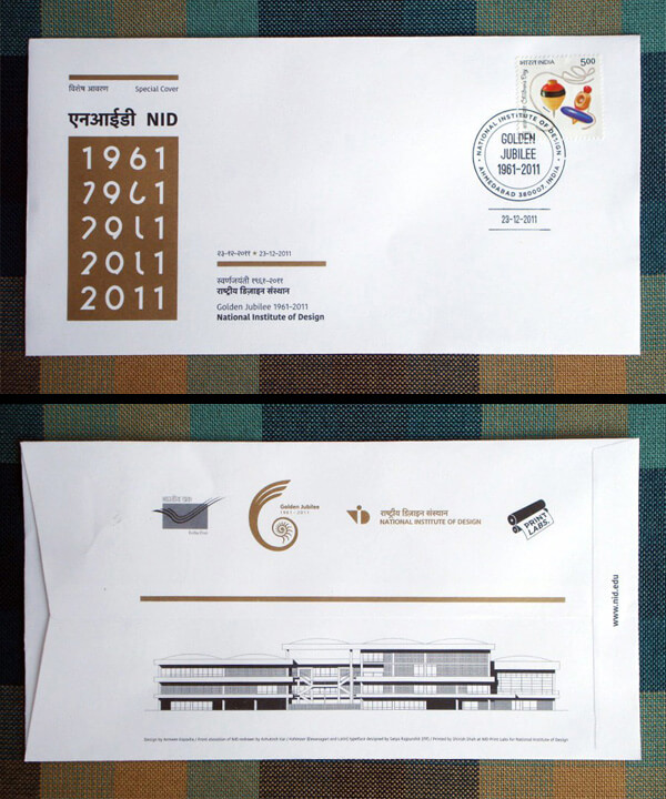
The Special Cover issued by India Post to celebrate 50 years of design education at the National Insitute of Design, Ahmedabad. Photo courtesy Armeen Kapadia
The tiny postage stamp is an often overlooked piece of communication design particularly in an increasingly electronic world where fewer letters are written every year, and fewer cards sent. From being an ubiquitous carrier of images on the corner of every envelope, it has taken on a more symbolic role as an object that commemorates events, marks history and announces a nation’s pride and identity to the world. In the age before advertising campaigns, stamps carried information and ideas between nations as much as the letters inside them. A beautiful stamp from a far off country had the power to make one lust for travel and long to discover the world outside one’s own borders, such was the power of a humble piece of sticky paper.
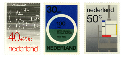
I have grown up collecting stamps and wherever possible I look for stamps related to the subject I’m researching. When I set out to find stamps about design from India, I was surprised to find not one single stamp either celebrating design or one that had been designed by an Indian designer. The absence of stamps about the subject is perhaps symptomatic of the ignorance about design in India. This is a stark contrast to the Netherlands where every significant graphic designer has, at some point, been invited to design for the Dutch Postal Service. The list includes some of my own heroes from Irma Boom to Wim Crouwel.
Nevertheless, in looking for the mark of our designers on our everyday mail, I found the work of young graphic designer Armeen Kapadia. As part of her final diploma project at the National Institute of Design, Ahmedbad, Armeen designed a set of stamps to commemorate the institution’s golden jubilee. Although the stamps have not been issued, India Post in Ahmedabad did approach her to design a Special Cover. Issued in time to coincide with NID’s convocation ceremony last year, these covers may well be the first acknowledgement of professional design activity in India.
In an in-depth interview conducted electronically, Armeen talks to Perch about the project:
;
PERCH: You’ve designed the recently issued special cover to celebrate the National Institute of Design’s golden jubilee. Are you a philatelist?
Armeen: Yes, I am a keen philatelist. I have been collecting stamps since quite a young age. I was lucky because some people just gifted me their own stamp collections when they stopped collecting. The collection now has around 3000 stamps and around 40 First Day Covers from all over the world. The oldest stamps are from around 1905.
PERCH: How did this project come about for you?
Armeen: This project actually started in mid-2008. I had finished my fourth semester in the post-graduate Graphic Design course at NID, and was looking for a diploma project. I wanted to do something with NID, but I wasn’t sure what.
Shilpa Das, Head Publication at NID had been my guide on my final classroom project. While talking to her one day, we came up with the thought that NID should have a commemorative stamp. We discussed it further, took the idea to the Director (then Dr. Darlie O’Koshy) to get his approval. We met with him, and not only did he did approve it, but also suggested that since NID would be celebrating its 50th year in 2011, this could be a Golden Jubilee commeorative stamp. The project was sponsored by the Research & Publications Department at NID and the entire team headed by Shashank Mehta was very supportive.
Along with the commemorative stamp, this diploma project also included creating content for, and designing a book about postage stamps, their significance, and the process of creating the NID stamp. The content for the book would provide a context for the stamp and the project. The research done for the content would also help me while designing the stamp, as it would include a study of images, and making meaning of images.
This was one of the rare occasions when a student proposed a project, and NID was able to sponsor it. It is largely thanks to Shilpa’s efforts. When Pradyumna Vyas became the Director, he too showed an interest in the project.
;
PERCH: If the initial project was to design a stamp, how did the Special Cover come about? What’s the story here?
Armeen: As part of the diploma project, I had only designed stamps, created the book, and very few First Day Covers. When the Baroda Office of India Post contacted NID, they were willing to do a Special Cover. A stamp has to be approved in Delhi, and the Government does not issue stamps for institutes celebrating Golden Jubillees, as per the current guidelines from India Post. It has to be at least a 100 years or more. This is not a First Day Cover, it is a Special Cover. First Day Covers are issued with commemorative stamps. Since there is no stamp, this Special Cover can be used with any other postage stamp available over the counter, and posted anywhere.
The India Post office in Ahmedabad contacted the director of NID, Pradyumna Vyas just before the Convocation 2012, and were keen to do a Special Cover. Shilpa Das then called me and said it was finally happening. After quite a lot of approvals and back and forth, it was under way. It was printed in the NID Press. Many people helped immensely, as I wan’t there for most of the time it happened. Shilpa Das of course, Tarun Deep Girdher, our graphic design faculty and head, printing labs took a keen interest and facilitated the entire printing process. Shirish Shah, Bharat Suthar and the entire staff of the NID press were enthusiastic and very involved. Sanjay Basavaraju helped immensely with the design of the cover, did all the coordination, getting approvals, and overlooked print production along with Tarun and Shirish Bhai. Friends and colleagues such as Smita Govindan, Milan Mistry, Shivani Gakhar, Elton, Vijith, Vidhi, Sanjay and others spent time helping with pre- and post-production.
A big question was which typeface to use on the cover. We had to use one that NID owned legally. And these didn’t have proper Devnagari counterparts. We contacted Satya, of Indian Type Foundry, and he was very helpful. He let us use Kohinoor Latin and Devnagari, developed by ITF. This really made the cover complete. Somehow in India, very little attention is paid to typography, though its improving slightly.
On the back of the cover, we used a the elevation of the NID building, redrawn by my senior Ashutosh Kar. I had seen this drawing of his in my first semester, when he was doing his classroom project. It also made the back of the cover complete.
Without any of these people, it would not have happened.
;
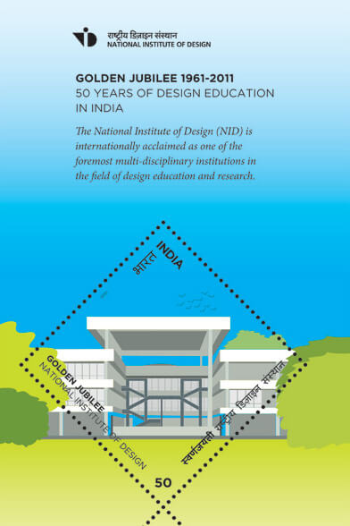
One of Armeen's options for the design of the stamp featured an illustration of the NID building. Image courtesy Armeen Kapadia
PERCH: Could you tell us a little bit about the concept?
Armeen: It started from a doodle. It was one of the earliest concepts, but I sort of just left it sitting there till almost the end of the project. One day I decided to work on it, and realized it had good potential. I first drew the forms by hand, and tried to figure out the smoothest transition from 1961 to 2011. I tried using an existing typeface, but that didn’t work, so I constructed the forms on the computer. I tried an option with the building and it looked like any run of the mill commemorative stamps for institutes. I had a few metaphorical concepts, which demanded that the viewer be familiar with the history of NID.
From all the ideas I had, this seemed to be the only solution that spoke of NID’s design philosophy and the journey of 50 years. This representation is inspired from the exercise all design students go through, of understanding how one form transforms to another. So it reflects both design and design education. Design itself is a process of transformation, of change. Design itself is transformative in nature, it changes the way we do even the most basic activities. I wanted that to be reflected in the final concept.
In total, there were around 20 concepts for stamps. I developed 6 of these into final stamps. The special cover shows one of the 6.
;
PERCH: The process of representing the history of an institution cannot have been a simple one: what was your approach to the brief?
Armeen: Broadly, there were four aspects to the project, that is research, design, prototyping, and the publication. Research and design went on simultaneously, as they enrich each other.
There were three aspects to the research, namely, research on stamps and philately, research on NID, and research on how design can be represented as a profession, and an activity. The research on stamps and philately was the easier aspect, as it involves tangibles.
The research on NID was challenging, as it involved understanding how people, both within and outside the institute, perceive it. Do people know of its history, and do people know of NID at all. I wanted to balance two things, representing NID, and also representing the spirit of design and design education. NID is primarily a design institute, although it has done considerable design consultancy work. One is the sub-set of the other. I spoke to most NID faculty, staff, many students, current, past and future.
I tried very hard to get permission to visit the Security Press at Nashik or Hyderabad where such printing happens, but a visit was not allowed. I visited the GPOs in Ahmedabad, Pune, Mumbai and Delhi, purchased several stamps and publications. I also tried my best to understand how stamps were printed, by reading up on the topic. A few YouTube videos on the printing of stamps in the USA also helped.
Simultaneously, I kept doodling my thoughts and idea of what the stamp could be in a book. All the research and analysis went into forming the publication. I also read many books in the NID library such as A Smile in the Mind, Visible Signs, Design: A Very Short Introduction, some of DeBono’s books, and books on Bauhaus and Ulm to understand their philosophies. At some point, one has to stop reading, otherwise it can be an endless process.
;
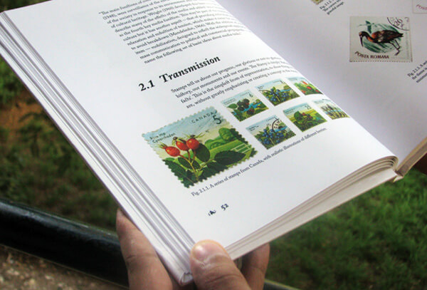
An accompanying publication traces the history of stamp design and includes much of Armeen's research. Image courtesy Armeen Kapadia
PERCH: In your experience as a graphic designer, you’ve worked on a wide variety of projects. How was this different from say, a publication or a poster? What were some of the differences in constraints?
Armeen: A stamp is a unique, and frequently overlooked medium. The size of stamps is what makes them very different from all other mediums. The constraints of the medium are its strengths. The small size of the stamp ensures that the message is distilled to the core. You get just around one square inch (give or take a few mm) to deliver your message. There can be no 500-word essay here, nor overly complex or abstract imagery. A stamp is usually just glanced at for a few seconds, if at all. Its biggest challenge is to try to halt the person’s gaze, even for a second more, so that it can tell its little story.
A thing that helped was redefining the brief. It helps you look at the problem in a different way, as sometimes we tend to get trapped in the confines of the design brief. Instead of focussing on creating a stamp, I shifted to creating an engaging and communicative image of 50 years of NID.
Stamps are traveling ambassadors of their countries. The stamp crosses the boundary of nation, time and space. We can understand some aspects of very different cultures and nations—which we may have never even visited—from stamps, even if they are in another language. In this sense, stamps require no translation. A stamp distills cultural aspects of countries, in a visual way that communicates to many people across the world. So the imagery on a stamp says a lot about the country of its origin. Even the smaller aspects such as the quality of printing, perforation, sensitivity to typography, all reflect on the country. This means the designer has to be extra careful, and has greater responsibility.
All these aspects of stamps affect the way a designer works on them. First of all, everything has to be worked in a 1:4 ratio. The original artwork can’t be larger that 4x of the final of size, because when you reduce it, fine lines etc just have a way of vanishing. The human eye and mind perceive the same image slightly differently when size changes. For instance, trees in a larger image may still look like trees. When made into a stamp, they may become unrecognizable.
In terms of production constraints, although the stamps were never officially issued, we did create samples as part of the project. Printing the stamps had its own challenges, as the quality of paper in digital printing is never what is actually used in offset printing.The size of the stamps had to be decided depending upon the offset sheet size. The hardest part was getting the perforations properly. This was finally done in the laser-cutting machine at NID. It required some trial and error.
;
PERCH: It sounds like designing a stamp is a serious business…
Armeen: Stamps themselves carry a certain responsibility, as the image they portray can have far reaching repercussions. Take for example, a stamp issued by the Dominican Republic in the Caribbean. The countries of Haiti and the Dominican Republic share the island of Hispaniola. For ethnic and political reasons, the relationship between the two countries had never been good, and there was some confusion regarding the exact position of the border on the island. The Dominican Republic issued a stamp in 1900, which showed a map of the country. People were quick to notice that the boundary ran quite a bit into what the Haitians considered to be their territory. The Haitian government objected to this diplomatically. The Dominican Republic reacted by sending troops to the border to push out any Haitians living in the disputed zone. Finally, the Dominican Republic withdrew the stamp under diplomatic pressure, but many issues of the stamp were already in circulation and in no way could be withdrawn. In a sense, the damage was done. Some years later in 1928 the Dominican Republic issued the first airmail stamp, which again raised issues about the border that was shown.
Posters, publications and so on are all carriers of our culture, but stamps are most strongly so. On a graph, stamps would come somewhere near currency. Stamps are time capsules, they are often preserved more than anything else, and they mark a significant moment in time. They possess historic value. Stamps create a feeling of ‘nation-ness’ because contain what a nation or culture considers of value. Because the stamp will remain in public memory, it is essential there should not be misrepresentation of any kind.
The audience for a book or a poster is far more clearly defined. Anyone and everyone may interact with a stamp. It could be an illiterate person, it could be a CEO. This throws up a lot of challenges. Of course, it is next to impossible to create something for everyone.
Because the stamp was representing 50 years of NID, and in effect if one can generalise, 50 years of design education in India, another challenge was deciding what kind of visual language, or illustration style should be employed. Should it be very minimalist, and true to the spirit of Bauhaus and Ulm, should it be more ornate and rich, because such work is perceived (sometimes wrongly) as ‘Indian’. It has to stand for one thing, strongly, that much was clear. Stamps are a visual historical overview of a nation.
Although the format of designing a stamp is very small, it is metaphorically very large.
;

Issued in 2001 by Switzerland, this stamp releases the sweet smell of chocolate when rubbed. Click on the image to see more unusual and sense-ational stamps issued by the Swiss.
PERCH: As far as the design of stamps goes, do you have any favorites? Any particular influences?
Armeen: The Swiss chocolate stamp. Its perfect, brilliant, simple. I can’t say anything more. I think the designer of that stamp has broken new ground. He or she has seen beauty in the obvious. I also am a huge fan of the Beatles stamps designed by Johnson Banks, UK. I was influenced by the stamps from Russia, Germany, Switzerland, Netherlands and UK. Australia and Canada produce high quality stamps. Many nations take great pride in their stamp culture and it reflects on the official postal websites of their countries.
I am influenced by graphic designers such as Armin Hoffman, Josef Muller Brockmann, Saul Bass, Massimo Vignelli and Paul Rand. I love the work of the artists Rene Magritte and M.C. Escher.
PERCH: If you could design any stamp at all, what would that be?
Armeen: Hmm.. tough one. This is unlikely. As far as my knowledge goes, the area of design is heavily protected by the Government of India after the Telgi scam. The stamps are designed by an in-house team and to be really honest, the design is largely bad. That is the only way one can sum it up. If ever, the Government of India opens up the process a little, India could have a fantastic stamp culture. Check out the stamps from Bhutan – they’re really inspiring. Personally though, I would like to design stamps on Indian literature.
;
***
Michael Russem of Kat Ran Press has worked hard to document stamps designed by type designers. His collection a real insight into the transformation of a simple stamp into a work of art. For stamps by the likes of Saul Bass, Eric Gill and Neville Brody, visit his website here.
If you know of an Indian designer who has designed a stamp, or even a stamp that celebrates Indian design (not necessarily issued in India), please tell us about it at perchmail[at]gmail[dot]com


1 comment
Prabuddha says:
Mar 22, 2012
good to know about the design process behind golden jubilee stamp. thanks for covering this article… hope every now and then I will get more such article to read on perchontheweb .