
The theme for this year’s Kyoorius Designyatra was ‘The Divide’. Speakers and delegates interpreted the idea in different ways and the theme became a focal point for fierce tea-time discussions.
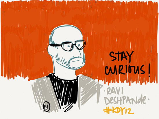
Ad guru Ravi Deshpande empahasised the need to bridge the divide by staying curious and eager to explore new concepts and approaches…
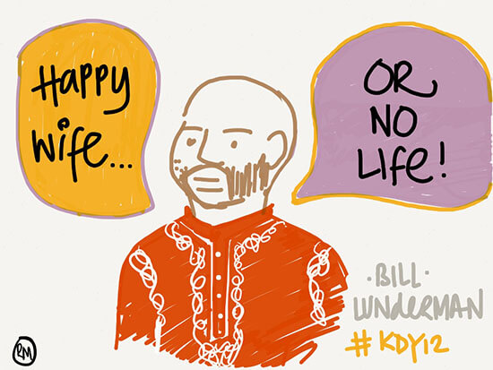
…while Bill Lunderman, VP Global Strategic Brand Design for Colgate-Palmolive made a crack at earlier speaker Robert Wong’s philosophy of “Happy Wife and Happy Life”.
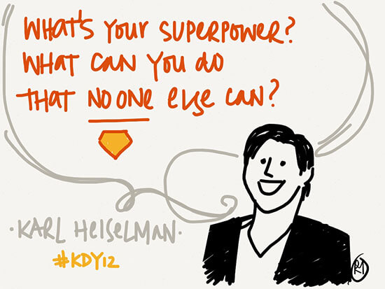
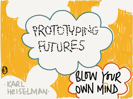
Karl Heiselman, CEO of Wolff Olins spoke of the challenges he faced when he moved from being a designer to running a business. By understanding core competencies and building on them he managed to overcome his own situtaion, but he the idea he says, also applies to the company.

…although, he said, nothing beats a great work culture. He showed examples of some incredible side projects and initiatives that Wolff Olins encourages as an organisation.
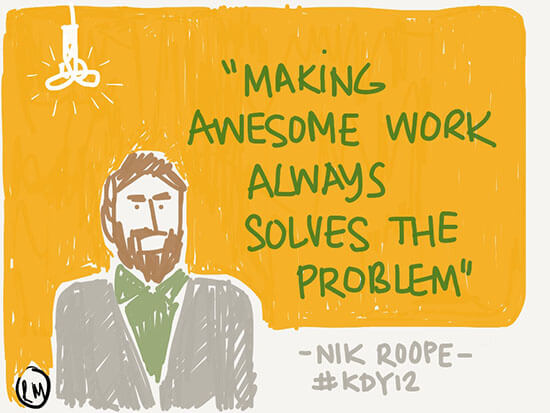
His Plumen CFL tube has completely changed the way the utilitarian object is considered. It won a Brit Insurance Design of the Year award in 2011, out-doing the iPad as the most significant product design for the year. Awards aside, it was evident from his talk that both quality and a committment to both process and product are key to any designer’s success.
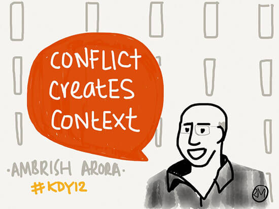
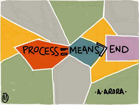
Ambrish Arora of Lotus Design stated quite clearly that for him, “the divide does not exist”. What does exist however, is conflict and out of conflict, his practice is able to re-define the context for their projects. Some of their most exciting work has been created in some of the most unlikely situtaions.
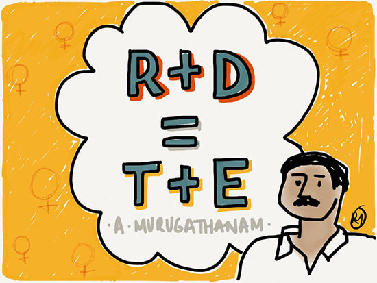
Conflict was also a key feature of Arunachalam Muruganantham’s story. A high-school dropout from a small village in South India, he was moved by the plight of women in his family who had to chose between spending money on food and buying sanitary towels for themselves. Against all odds, he persevered to find a way to make low-cost napkins through sheer grit, tenacity and what he calls the “Trial and Error Method”. His story moved the audience to tears and left us thinking for a long time afterwards.

By the end of Day 2, Masashi Kawamura re-iterated what many had said was the key to craftsmanship: the importance of prototyping.
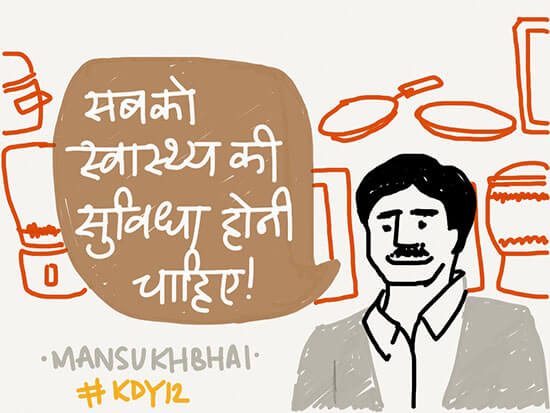
High from the previous day, Mansukhbhai Prajapati brought us back to earth with his range of eco-friendly, low-cost products from the Mitticool range. A humble potter from Gujarat, his range of clay fridges, cookware and water storage units have made everyday conviniences available to people for a fraction of what FMCG companies sell them for. “Health is something everyone should be able to afford,” he says.
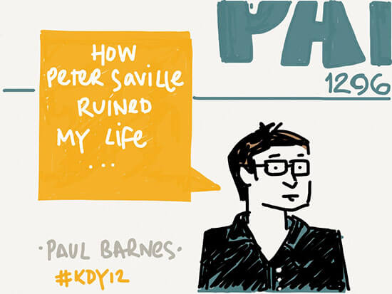
On a different note, British type designer Paul Barnes gave an impassioned lecture on the importance of history in design. Citing his project to re-design The Guardian newspaper and create a logo for Kate Moss, he talked about how, for him, it all came down to understanding the history of communication. That and a certain moment when he first laid eyes of a record cover designed by Peter Saville.
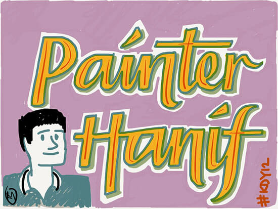
Paul Barnes talk led nicely into Hanif Kureishi’s project called Handpainted Type. Hanif is attempting to digitise hand-paintered lettering by converting letters to fonts, thereby preserving an aesthetic fast disappearing from the Indian streetscape.
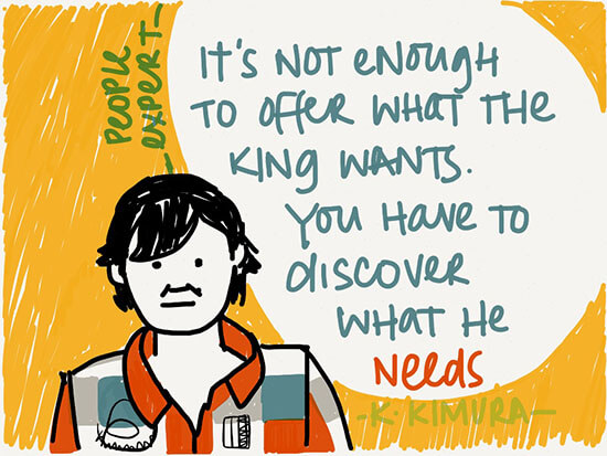
Kentaro Kimura narrated a lovely little parable about a king (the client). His presentation reminded us that even commercial projects can answer very simple, human needs rather than just bottomlines.
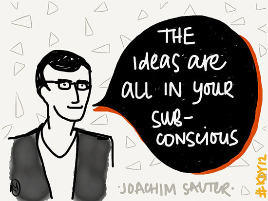
Art+Com’s work transported us to another dimension altogether. A powerful combination of innovative code and inspired use of technology, their projects delighted an audience that oohed and aahed at every turn.

Ending on a high, lettering lady extraordinaire, Marian Bantjes had a simple poignant message for us to take away from Designyatra 2012.
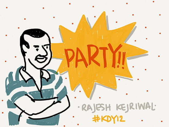
By the end of Day 3, there was only one thing left to do. The celebrations continued long into the night.
These sketches were created live at Designyatra 2012 using the Paper app on an iPad.
To see more sketches, join us on Facebook.
All sketches, text and material are © Ruchita Madhok, 2012. Please do not distribute without permission.

3 comments
Surbhi Sethi says:
Sep 11, 2012
Nicely done Ruchita! So much more interesting than a 3000 word article summarizing the event.
That Great Divide | Perch says:
Sep 28, 2012
[…] * This essay was written as part of the Design Writing workshop hosted by Kyoorius and organised by the British Council at Designyatra 2012 in Goa. Tags: designyatra, divide, karl heiselman, kdy12, kyoorius, wolff olins Previous postSketchnotes from Kyoorius Designyatra 2012 […]
Perch in 100% Yatra | Perch says:
Feb 19, 2013
[…] other artists and designers to reflect on the word “yatra/journey” My sketches from Kyoorius Designyatra 2012 formed a collage in the zine. My digital sketchbook is a travelogue through different conversation […]